Bowser Watch WA
Contains ads
4.4star
823 reviews
50K+
Downloads

Everyone
info
About this app
Find the nearest and/or cheapest fuel in Western Australia.
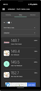
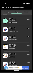
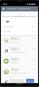
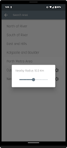
Search for fuel by metro area, by suburb(s) & regional areas or just nearby.
Suburbs and Regions can be added together for users on the edge of the Metro area.
Search can be filtered by fuel type and fuel company brand(s).
Results can also be sorted by price or distance.
See tomorrow's prices after 2:30pm when they are released to the public.
Note the app uses data from the Department of Commerce Western Australia and the FuelWatch service.
Updated on
Safety starts with understanding how developers collect and share your data. Data privacy and security practices may vary based on your use, region, and age. The developer provided this information and may update it over time.


Ratings and reviews
4.3
799 reviews

Alicia Harlow
- Flag inappropriate
August 20, 2022
It's good but not great. In list view, I would prefer a more compact view to see more stations on screen like before. I understand older people may need larger font but maybe a sans serif. I also miss the map view. I drive for work and found the green markers of stations in the area I am driving to and along the way really helpful.
2 people found this review helpful
A Clark
August 27, 2022
I have compacted the standard view and added a paired back condensed view. The map view is back and the colourised view will be back very soon.

Pene Lope
- Flag inappropriate
February 15, 2022
Im looking for a better app but i can't find one... It's ok, but it's glitchy with location: distances are wrong and find it frustrating that the only way to get an accurate distance is to select directions. In a pinch this extra step is totally unhelpful. If one combined bowser watch with fuel map you might have the perfect app... Might. 🤷🏼♀️
5 people found this review helpful

Douglas Dielle
- Flag inappropriate
- Show review history
March 2, 2023
Not bad for a refresh, but list fonts are too small. Can we emphasise the surburb on the list? That is what I'd scan for when deciding where to fill up. Street address isn't so important - Google maps can take me there. A persistent quick toggle control for list and map would be great. The balloon markers on the map could be replaced with a brand logo and price instead. Caltex Woolworths should be EG Ampol in settings? I bought the paid version before and will that be getting a refresh as well?
1 person found this review helpful
A Clark
March 2, 2023
Thanks for your feedback,
I am currently finishing a new version for both the paid and ad supported versions.
I have taken on board a lot of people's feedback and will also take onboard your ideas. The refresh will be an evolution rather than a big change.
What's new
Map View Back!
Brand Filter promoted to quick settings.
UI refinements, new condensed list version.
Support for large fonts.
Bug fixes.
Brand Filter promoted to quick settings.
UI refinements, new condensed list version.
Support for large fonts.
Bug fixes.