Minimal O - Icon Pack
In-app purchases
4.7star
2.25K reviews
50K+
Downloads

Rated for 3+
info
About this app
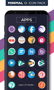
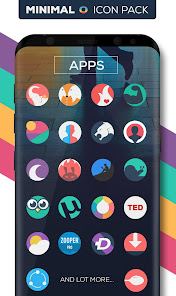
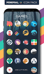
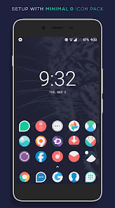
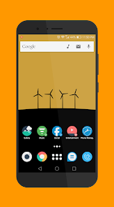
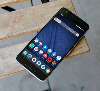
This is the circular version of MINIMALIST ICON PACK
Complement your mobile screen with exclusive Minimal looking rounded Icons. Each icon is a real masterpiece and designed in order to create a perfect minimal look. minimal o Icon Pack have been designed with a Perfect blend of creativity with simplicity enhancing your mobile experience.
And do you know?
An average user checks their device more than a 50 times in a day. make each time a real pleasure with this MINIMAL O ICON PACK.
There's always something new:
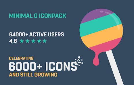
Minimal O Icon pack has 6450+ icons. and More icons will be added with regular updates.
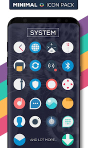
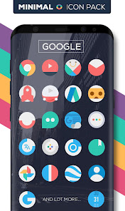
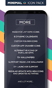
FEATURES
• Icon Pack with 6450+ icons. (Adding more with every updates.)
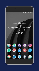
• Eye-Pleasing Pastel Color
• Category-based Icons Grid
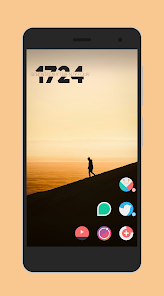
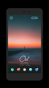
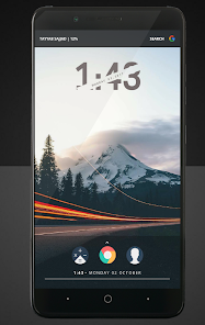
• 70+ Unique & Supreme collection of wallpapers for your screen. (more wallpapers will be added)
• Icon preview and search.
• Slick Material Dashboard.
• Custom folder icons
• Custom app drawer icons.
• Easy Icon Request
• FAQ section with search option
• Suppport Muzei Live Wallpaper
DISCLAIMER
• A supported launcher is required to use Minimal o icon pack!
• FAQ section inside the app which answers a lot of questions you may have.Please read it before you emailing your question.
minimal o Icon Pack Supported Launchers
Action Launcher
ADW Launcher
Apex Launcher
Atom Launcher
Aviate Launcher
CM Theme Engine (not supported on some versions)
GO Launcher
Holo Launcher
Holo Launcher HD
LG Home (not supported on some versions)
Lucid Launcher
M Launcher
Mini Launcher
Next Launcher
Nougat Launcher
Nova Launcher
Smart Launcher
Solo Launcher
V Launcher
ZenUI Launcher
Zero Launcher
ABC Launcher
Evie Launcher
minimal o Icon Pack Supported Launchers not Included in Apply Section
Arrow Launcher
ASAP Launcher
Cobo Launcher
Line Launcher
Mesh Launcher
Peek Launcher
Z Launcher
Launch by Quixey Launcher
iTop Launcher
KK Launcher
MN Launcher
New Launcher
S Launcher
Open Launcher
Flick Launcher
minimal o icon pack has been tested, and it works with these launchers. However, it may also work with others too.In case you do not found an apply section in dashboard. You can apply icon pack from a theme setting.
Extra Notes
• Google Now Launcher do not support any icon packs.
• Missing an Icon? feel free to send me an icon request and I will try to update this pack with your requests.
Contact
Google+: https://plus.google.com/communities/110791753299244087681
Email : maknojiyajuned@gmail.com
CREDITS
• Dani Mahardhika for providing a great dashboard.
Complement your mobile screen with exclusive Minimal looking rounded Icons. Each icon is a real masterpiece and designed in order to create a perfect minimal look. minimal o Icon Pack have been designed with a Perfect blend of creativity with simplicity enhancing your mobile experience.
And do you know?
An average user checks their device more than a 50 times in a day. make each time a real pleasure with this MINIMAL O ICON PACK.
There's always something new:
Minimal O Icon pack has 6450+ icons. and More icons will be added with regular updates.
FEATURES
• Icon Pack with 6450+ icons. (Adding more with every updates.)
• Eye-Pleasing Pastel Color
• Category-based Icons Grid
• 70+ Unique & Supreme collection of wallpapers for your screen. (more wallpapers will be added)
• Icon preview and search.
• Slick Material Dashboard.
• Custom folder icons
• Custom app drawer icons.
• Easy Icon Request
• FAQ section with search option
• Suppport Muzei Live Wallpaper
DISCLAIMER
• A supported launcher is required to use Minimal o icon pack!
• FAQ section inside the app which answers a lot of questions you may have.Please read it before you emailing your question.
minimal o Icon Pack Supported Launchers
Action Launcher
ADW Launcher
Apex Launcher
Atom Launcher
Aviate Launcher
CM Theme Engine (not supported on some versions)
GO Launcher
Holo Launcher
Holo Launcher HD
LG Home (not supported on some versions)
Lucid Launcher
M Launcher
Mini Launcher
Next Launcher
Nougat Launcher
Nova Launcher
Smart Launcher
Solo Launcher
V Launcher
ZenUI Launcher
Zero Launcher
ABC Launcher
Evie Launcher
minimal o Icon Pack Supported Launchers not Included in Apply Section
Arrow Launcher
ASAP Launcher
Cobo Launcher
Line Launcher
Mesh Launcher
Peek Launcher
Z Launcher
Launch by Quixey Launcher
iTop Launcher
KK Launcher
MN Launcher
New Launcher
S Launcher
Open Launcher
Flick Launcher
minimal o icon pack has been tested, and it works with these launchers. However, it may also work with others too.In case you do not found an apply section in dashboard. You can apply icon pack from a theme setting.
Extra Notes
• Google Now Launcher do not support any icon packs.
• Missing an Icon? feel free to send me an icon request and I will try to update this pack with your requests.
Contact
Google+: https://plus.google.com/communities/110791753299244087681
Email : maknojiyajuned@gmail.com
CREDITS
• Dani Mahardhika for providing a great dashboard.
Updated on
Safety starts with understanding how developers collect and share your data. Data privacy and security practices may vary based on your use, region and age The developer provided this information and may update it over time.

No data shared with third parties
Learn more about how developers declare sharing

No data collected
Learn more about how developers declare collection
Ratings and reviews
4.7
2.22K reviews

A Google user
- Flag inappropriate
- Show review history
15 June 2019
Minus 2 stars. Haven't seen changes from recent updates... I've had to use some icons from a different icon pack that looks similar to compensate. // Update Aug 17, 2018: Still loving the icon pack and I appreciate how the dev/s took heed of suggestions from users. But I'm still bugged by the inaccuracy of some icon colors... Pixlr is a bit better but the colors are not even close except for the gray part. Mood is also supposed to be closer to lavander like the color they used for Discord, NOT purple like Viber's... And why does the icon for Avast antivirus look so weird? Avast never had a logo that looks like a clock. I sent an email about this. Hopefully these get fixed in the next update. // Update Apr 7, 2018: There are still messaging apps that don't have a round alternative... And some of the icon colors are way off (i.e. Mood Messenger's icon is supposed to be lavander, NOT light blue). And the icon for Pixlr still looks very weird--it's too simple it doesn't even resemble anything like the original icon. Not even the colors! Also, I wish they'd add other options for the default music player icon. Xperia phones like mine have the Walkman and there's not even a single icon for it... Just the weird "Beats"-looking icon. And it would be great if there's just a plain round alternative to everything else like what they did to the Gboard icons. Right now, there are icons like Titanium Backup's that is not inside a circle but on its own with it's freeform shape. I still love using this icon pack so far and haven't changed to others yet since I installed it. Hopefully the dev reads this review and consider the points above for the next update. THANKS! // Love it! Soft tones and simple yet aesthetically appealing design. A little hefty download, though. I just wish all messaging type apps have a round alternative instead of just the teardrop shape. Still looks great, nonetheless.
33 people found this review helpful
JustNewDesigns
7 April 2018
Thankyou for taking time and writing this review. Will surely fix possible issue in a next update. 😊😊

Z. Brown
- Flag inappropriate
26 February 2023
This is a pretty good pack. There are lots of icons. It is a bit incohesive (some with white borders, some without, different shapes for some apps), but that's supposed to be part of its charm. That being said, I wish colors matched more across icons (e.g. icons for commonly used stock apps, like messages, have a different shade of red than most of the pack uses).
2 people found this review helpful

Porter Lyman
- Flag inappropriate
- Show review history
11 November 2020
The only icon app you'll ever need to buy. I always come back to this one. The color pallette matches most wallpapers extraordinarily well. The icons, although with a new designs, still resemble the original icon enough to be recognizable. Icon masking is pretty much perfect. I've tested out other packs on and off (like Squirclx) but nothing else comes close. Minimal O is somehow very stylish and generic at the same time, making it a perfect fit for any home screen.
32 people found this review helpful
What's new
6.4
• 50+ New Icons (Total 7000+ icons)
• Added New & Missing Activities
Please take a moment and support further development by giving us a 5star ♥ THANKYOU ♥
6.1
• 50+ New Icons
...
..
.
5.7
100+ New Icons
5.6
• 50 New Icons : Total 6750+ icons
5.5
• 35 New icons
5.4
• 30 New icons
5.3
• 17 New icons
5.2
• 17 New icons
5.1
• 15 New icons
5.0
• 17 New Icons
4.9
• 25 New Icons
4.8
• 48 New Icons
.
.
..
1.0
Initial Release with 700 Icons
App support
phone
Phone number
+18735888999


