
Linebit Light Icon Pack
In-app purchases
4.4star
318 reviews
10K+
Downloads

Everyone
info
About this app
Enjoy a new version of Linebit in white.
Features:
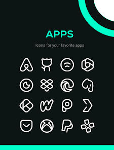
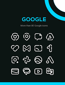
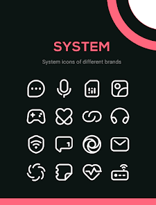
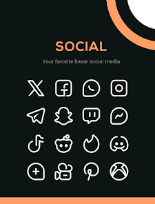
★ 4600+ Icons
★ 22 Wallpapers
★ Dynamic calendar icons
★ Support for many launchers
★ Efficient icon request system
★ Frequent updates
How to apply these icons?
1. Install a compatible Launcher
2. Open Linebit Light, go to the Apply section and select the Launcher.
Supported Launchers:
Smart Launcher 6 - Nova Launcher - Lawnchair - Action Launcher - Apex Launcher - Flick Launcher - GO Launcher - Hyperion Launcher - Lucid Launcher - Microsoft Launcher - Mint Launcher - Niagara Launcher - Pie Launcher
These launchers have been tested and are fully compatible, but will probably work with other launchers not mentioned here.
Contact Me
If you have any questions, feel free to contact me through these means.
▸ edzon.dm@gmail.com
▸ https://twitter.com/EdzonDM
Features:
★ 4600+ Icons
★ 22 Wallpapers
★ Dynamic calendar icons
★ Support for many launchers
★ Efficient icon request system
★ Frequent updates
How to apply these icons?
1. Install a compatible Launcher
2. Open Linebit Light, go to the Apply section and select the Launcher.
Supported Launchers:
Smart Launcher 6 - Nova Launcher - Lawnchair - Action Launcher - Apex Launcher - Flick Launcher - GO Launcher - Hyperion Launcher - Lucid Launcher - Microsoft Launcher - Mint Launcher - Niagara Launcher - Pie Launcher
These launchers have been tested and are fully compatible, but will probably work with other launchers not mentioned here.
Contact Me
If you have any questions, feel free to contact me through these means.
▸ edzon.dm@gmail.com
▸ https://twitter.com/EdzonDM
Updated on
Safety starts with understanding how developers collect and share your data. Data privacy and security practices may vary based on your use, region, and age. The developer provided this information and may update it over time.

No data shared with third parties
Learn more about how developers declare sharing

No data collected
Learn more about how developers declare collection
Ratings and reviews
4.4
314 reviews

A Google user
- Flag inappropriate
February 19, 2020
I love this icon pack, but the new Discord icon is horrible. I realize you may have been forced to change some of the logos, but please, change it to something that looks more like the original. Even the lines are thinner (or at least look thinner) than in the other icons. Still, you get 5 stars from me, because you clearly work hard and the pack is being updated regularly.
17 people found this review helpful

Suha Ones
- Flag inappropriate
July 19, 2023
Very clean and thorough icon pack. Love to use it. Some apps missing but can easily substitute another. One wish though: A hinted version with Monet (adaptive/dynamic tints) would be really good. I also recommend the colored version too. Excellent work.
3 people found this review helpful

Phil S.
- Flag inappropriate
April 18, 2021
Pretty much the perfect icon pack for me in terms of design - reduced yet easily identifiable, perfect for dark backgrounds (easy on the battery) yet not too bright like Whicons. The downfall is how shockingly bad the developer is at adding icons. How can you offer an icon pack and not cover total basics like Google Pay and Sonos, which millions have on their home screens? I requested them dozens of times, even wrote them emails. On 15 April 2021 finally an update lands - and nothing is fixed.
12 people found this review helpful
What's new
✦ 100 New icons
✦ 21 Premium icons
✦ Fixed some icons not applying
✦ 21 Premium icons
✦ Fixed some icons not applying


