Oxigen McLaren - Icon Pack
In-app purchases
4.5star
203 reviews
1K+
Downloads

Everyone
info
About this app
INFORMATION:
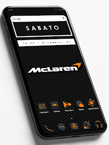
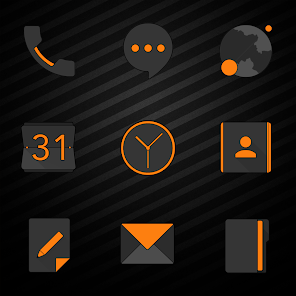
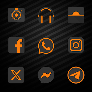
* 2430 Icons Resolution 2K SuperHD+(350 X 350)Pixel!
* 100 HD Wallpapers with Resolution 2K (1440x2560) Pixel!
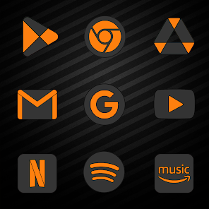
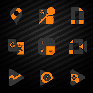
* Each icon has been designed with extreme care of the details!
* Triple Icons Render Process!
* New Icons Saturation System!
* Detail Cleaning and Sharpness of Icons!
* Dynamic Calendar for App Stock & Google Calendar!
* Inquiry Icons Missing directly through the app (3 Free for each release)!
* Update Periodicals Guaranteed!
INFO USE:
• This Icon Pack needs a compatible launcher to be applied (Nova Launcher, Action Launcher, etc.)!
Special thanks to D. Mahardhika for CandyBar.
* 2430 Icons Resolution 2K SuperHD+(350 X 350)Pixel!
* 100 HD Wallpapers with Resolution 2K (1440x2560) Pixel!
* Each icon has been designed with extreme care of the details!
* Triple Icons Render Process!
* New Icons Saturation System!
* Detail Cleaning and Sharpness of Icons!
* Dynamic Calendar for App Stock & Google Calendar!
* Inquiry Icons Missing directly through the app (3 Free for each release)!
* Update Periodicals Guaranteed!
INFO USE:
• This Icon Pack needs a compatible launcher to be applied (Nova Launcher, Action Launcher, etc.)!
Special thanks to D. Mahardhika for CandyBar.
Updated on
Safety starts with understanding how developers collect and share your data. Data privacy and security practices may vary based on your use, region, and age. The developer provided this information and may update it over time.

No data shared with third parties
Learn more about how developers declare sharing

No data collected
Learn more about how developers declare collection

Data isn’t encrypted
Data can’t be deleted
Ratings and reviews
4.5
203 reviews

BugattiBeefCake (BugattiBeefCake)
- Flag inappropriate
May 7, 2021
Looks pretty bad compared to the official icons. Nice idea but the colours are too bright, the cutoff between the black and orange is extremely sharp and there's no gradient to anything so it ends up unfortunately looking pretty unprofessional. You may like it, but that's up to you to try. For me, it's not a replacement as much as I wished it could've been.
7 people found this review helpful

Gerrit R.
- Flag inappropriate
April 29, 2024
Have been using this icon pack for years now and still love it. Simple, set elegant. Works well together with the Nova Launcher.
Cris87
April 29, 2024
Grazie Mille!!!

A Google user
- Flag inappropriate
March 22, 2020
very good selection of icons but its just too much messing about the process of swapping them over. also, the wallpapers (of which there are plenty enough) when applied are poor quality after being expanded to fit screen. couldn't find the 'Mc claren' wallpaper as shown either but that could just be me.
2 people found this review helpful
What's new
- 15 new Icons;
- 2430 Total Icons;
- 100 Total Wallpaper with Resolution 2K;
- New Graphical Interface!
- Added Multilanguage Support!
- Added Support for Many New Launchers!
- Added Donation Buttons and Request Premium Icons!
- Added Social link(Telegram, Instagram and Facebook) in About Section!
- 2430 Total Icons;
- 100 Total Wallpaper with Resolution 2K;
- New Graphical Interface!
- Added Multilanguage Support!
- Added Support for Many New Launchers!
- Added Donation Buttons and Request Premium Icons!
- Added Social link(Telegram, Instagram and Facebook) in About Section!


