
myenergi
3.2star
2.27K reviews
100K+
Downloads

Everyone
info
About this app
The myenergi app is the centre of your myenergi ecosystem and a must for anyone who uses our eco smart products.
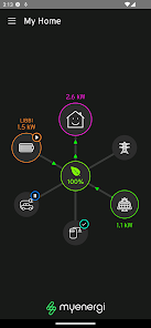
It provides a simple, visual dashboard to allow you to see just how your devices are working hard to reduce your energy cost and carbon footprint. The app seamlessly connects to all of your myenergi devices, giving you full control and access from anywhere in the world.
Main features:
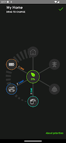
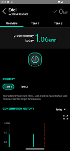
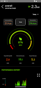
- View current household power distribution and consumption at a glance
- Intuitive animated display showing import/export, generation, power diversion and consumption
- Live and historic Self-Consumption and Green Contribution indicators
- Data is updated real-time
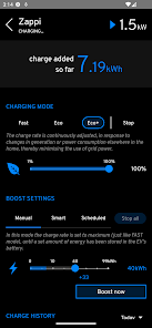
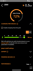
- Remotely control & monitor your devices
- Intelligent scheduling of devices with smart tariff integrations
- Priority setting of different devices
It provides a simple, visual dashboard to allow you to see just how your devices are working hard to reduce your energy cost and carbon footprint. The app seamlessly connects to all of your myenergi devices, giving you full control and access from anywhere in the world.
Main features:
- View current household power distribution and consumption at a glance
- Intuitive animated display showing import/export, generation, power diversion and consumption
- Live and historic Self-Consumption and Green Contribution indicators
- Data is updated real-time
- Remotely control & monitor your devices
- Intelligent scheduling of devices with smart tariff integrations
- Priority setting of different devices
Updated on
Safety starts with understanding how developers collect and share your data. Data privacy and security practices may vary based on your use, region and age The developer provided this information and may update it over time.

No data shared with third parties
Learn more about how developers declare sharing

This app may collect these data types
Personal info, App activity and App info and performance

Data is encrypted in transit

You can request that data be deleted
Ratings and reviews
3.2
2.16K reviews

John McFarlane
- Flag inappropriate
24 September 2023
Great app/device (Zappi 2 in my case) but UX is a disaster. Aesthetics: a combination of neon on black & brushed steel make for poor accessibility. Controls are awkward and laggy: text entry fields disappear off the side of the screen & activity is blocked on network traffic. But worse, modes of operation and their presentation. 'Boost' seems to replace 'charge' arbitrarily. Desc. for Eco and Eco+ are identical and opaque. Great hardware fights against frustrating software.
5 people found this review helpful

Pat Garvan
- Flag inappropriate
12 July 2024
Good to view the information about .the power used, generated, and sent back to the grid. However, I find it not very responsive to use having to repeatedly select icons to get that function to work. Also, I find that the information appears not to reflect what is happening on the eddi diverted. It either lags or leads?

Philip Galea
- Flag inappropriate
9 June 2024
Dashboard is great, sadly controls are not so great and lacking. Needs overhauled such as having do not heat schedules and more heat slots instead of just 4 per tank. Also I'm not sure if its session management or establishing connection with actually eddi but I find there to be a bit of latency sometimes when setting values and I need to try two or three times. Having a seasonal profile would be nice to swap in and out schedules spring Vs summer Vs autumn etc. I have a ton of ideas....
2 people found this review helpful
What's new
- new eddi icons
App support
phone
Phone number
+443333001303