
MyMMU - Mobile
3.9star
399 reviews
50K+
Downloads

Everyone
info


About this app
Welcome to MyMMU mobile, a pioneering application that allows students to access comprehensive information about Manchester Metropolitan University.
Manchester Metropolitan University is one of the first of a group of leading universities in the UK to roll out this application to its students enabling them to stay informed with the ease and convenience that mobility brings.
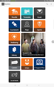
Current Features:
-Search Campus Maps for buildings and locations
-View your Library Loans
-Course Information
-Search the Staff Directory
-Receive the latest News and Events from the University and the Students’ Union
New features are being planned so please check the support website for future features.
*** Please note: When launching the app for the first time, please be connected to WiFi as it downloads the campus maps and other information.
Manchester Metropolitan University is one of the first of a group of leading universities in the UK to roll out this application to its students enabling them to stay informed with the ease and convenience that mobility brings.
Current Features:
-Search Campus Maps for buildings and locations
-View your Library Loans
-Course Information
-Search the Staff Directory
-Receive the latest News and Events from the University and the Students’ Union
New features are being planned so please check the support website for future features.
*** Please note: When launching the app for the first time, please be connected to WiFi as it downloads the campus maps and other information.
Updated on
Safety starts with understanding how developers collect and share your data. Data privacy and security practices may vary based on your use, region, and age. The developer provided this information and may update it over time.

No data shared with third parties
Learn more about how developers declare sharing

This app may collect these data types
Location, Personal info and 3 others

Data is encrypted in transit
Ratings and reviews
3.7
370 reviews

A Google user
- Flag inappropriate
August 31, 2019
After the new update i have opinions. First, it looks just gorgeous. The home screen is arranged beautifully with consistent colours. It gives the feel that the designers really thought about the aesthetic of the page. It makes the app to feel fresh, clear and cool. While the previous screen was practical, it was boring to look at. Also, things are more optimised to phones. In the past if i clicked on Union, the page zoomed out. Now it opens and perfectly matches my screen. I'm pretty satisfied.
7 people found this review helpful

Angel Mellor-Davis
- Flag inappropriate
February 22, 2022
Generally works fine but sometimes logs me out so I log back in and it displays an error message, only way to fix this is to delete the app and reinstall it. Also it's only useful for looking at your timetable, Moodle takes you to a webpage where you have to log in again and doesn't display well on mobile. I would recommend it for your timetable but use the computer if you can for anything else
7 people found this review helpful

James Lynch
- Flag inappropriate
February 23, 2023
Is this someone's unfinished computer science coursework or..? The app is superfluous given that it's just a collection of bookmarks that redirect you to the browser, which is something I can do, you know, in the browser. Then account for how broken and buggy it is anyway, and it's 1 star for this purposeless bloatware. Sort it out MMU.
4 people found this review helpful
What's new
Bug fixes and performance enhancements