
Börse Stuttgart
1.5star
666 reviews
50K+
Downloads

Everyone
info


About this app
With the App Stuttgart Stock Exchange for your Android smartphone and tablet, you stay on the road always up to date. See at a glance what's happening in the market, how the values on your watchlist have changed, and where the Euwax Sentiment is.
The most important functions at a glance:
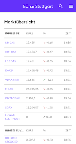
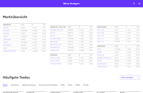
• Current market overview of the most important indices
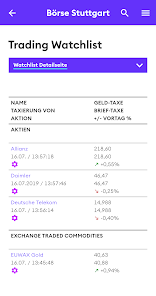
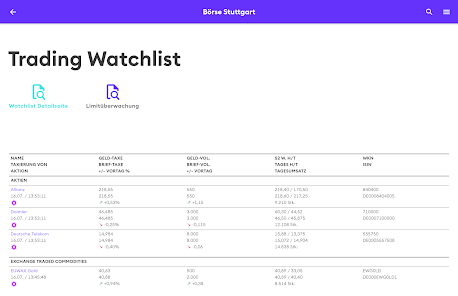
• All favorites in the overview: with Watchlist and Portfolio
• Current top sellers and most common trades in each type of security from shares to certificates
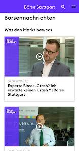
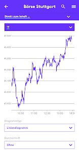
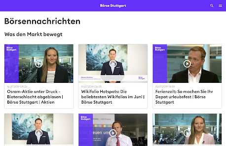
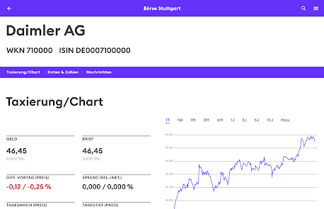
• Individual presentation of all securities with real-time price data, charts and news
• Euwax real-time sentiment - the retail investor index for leverage products
• Push notification for limit monitoring
The most important functions at a glance:
• Current market overview of the most important indices
• All favorites in the overview: with Watchlist and Portfolio
• Current top sellers and most common trades in each type of security from shares to certificates
• Individual presentation of all securities with real-time price data, charts and news
• Euwax real-time sentiment - the retail investor index for leverage products
• Push notification for limit monitoring
Updated on
Safety starts with understanding how developers collect and share your data. Data privacy and security practices may vary based on your use, region, and age. The developer provided this information and may update it over time.


Ratings and reviews
1.5
588 reviews

A Google user
- Flag inappropriate
- Show review history
August 12, 2019
Really bad! Compared to the wonderful App before (Design & Functions) it is a big step down! Why did you do that??? What' s the reason? Charts (no specific values at specific dates anymore), Basic Design, Seize of Names and Numbers (to small!), Tipping on a Value/Asset= whole Display changes to violett!?? Must tipp exactly on the Name of the asset that it opens and so on and on.... Everything worse!!! Just give us back the old design and Functions! Please!!! Big Downturn!
4 people found this review helpful
A Google user
- Flag inappropriate
- Show review history
February 7, 2019
most time not working, neither on iOS nor on Android
4 people found this review helpful

Stone
- Flag inappropriate
February 5, 2024
App notification cannot be enabled.
What's new
Wir haben technische App-Komponenten aktualisiert.