
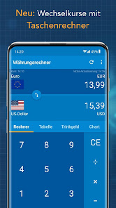
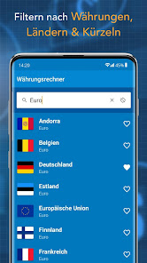
Currency Converter Finanzen100
Contains ads
4.1star
8.65K reviews
1M+
Downloads

Everyone
info


About this app
Safety starts with understanding how developers collect and share your data. Data privacy and security practices may vary based on your use, region, and age. The developer provided this information and may update it over time.

This app may share these data types with third parties
App activity, App info and performance, and Device or other IDs

No data collected
Learn more about how developers declare collection

Data isn’t encrypted
Ratings and reviews
4.3
8.24K reviews

Goetz Kohlberg
- Flag inappropriate
November 21, 2025
waS great until the management got mental and thought ads are needed. I would pay to get an ad free version ... but how to talk to mental people?

A Google user
- Flag inappropriate
September 1, 2019
The old design was much better. Could type in both currencys and get the equivalent out. I. The new design you have to swap the currency first, really annoying.
1 person found this review helpful
A Google user
- Flag inappropriate
- Show review history
July 28, 2019
It was the best converter, but the new design and updated version sucks. Blue drains the battery faster. Not handy anymore. Changed to another one.
8 people found this review helpful
What’s new
In diesem Release:
- Optimierungen
- Bugfixes
- Optimierungen
- Bugfixes
App support
About the developer
BurdaForward GmbH
android@focus.de
St.-Martin-Str. 66
81541 München
Germany
+49 89 92504500

