
Tuntihinta
3.8star
902 reviews
100K+
Downloads

Everyone
info
About this app
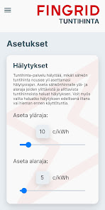
Hourly rate service allows you to keep track of the stock market price of electricity. Service warning if the hourly price of electricity exceeds the alarm limit set by the user. Price data can help you reduce electricity consumption when electricity is expensive and take advantage of the cheapest classes.
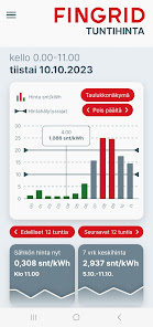
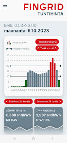
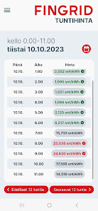
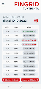
The hourly price of electricity in the Nordic electricity market varies every hour. Hourly fees will be published the day before the next day's classes. The service seems to Finland hourly electricity prices.
Hourly rate the best out of service shall, if the user's electricity consumption is measured on an hourly basis, the seller of electricity to charge an hour based on measurements, as well as the customer buys electricity from the electricity stock exchange-linked tuntihinnoitellulla electrical product.
Updated on
Safety starts with understanding how developers collect and share your data. Data privacy and security practices may vary based on your use, region, and age. The developer provided this information and may update it over time.

No data shared with third parties
Learn more about how developers declare sharing

This app may collect these data types
App activity, App info and performance, and Device or other IDs

Data is encrypted in transit

You can request that data be deleted
Ratings and reviews
3.8
848 reviews

Miika H
- Flag inappropriate
- Show review history
December 5, 2023
The previous version was significantly better in terms of usability. It had the whole day (24h) at once and the current situation was presented on a line without additional presses and it was much easier to get to the table view when in the new version the table is hidden behind the menu. Visually, the new one is perhaps "prettier", but the practicality is now completely gone.
21 people found this review helpful

Oleg Korzhukov
- Flag inappropriate
- Show review history
May 6, 2024
The app was terrible after recent big UI update but, they fixed everything with time and it is okay now.

David Zautasvili
- Flag inappropriate
- Show review history
October 19, 2023
Great that you read the feedback and improved. 24h view is great, the new green bars are great. Congrats! Price labels when moving finger along the bars is not working too well, might need some fine tuning (when bar is tall and label hides the pointer line). If you make the screen fit without scrolling it will be great looking as well. Dinamic scaling would be good to change, maybe a more stable scale for the week is easier to digest. Please highligh the current price on the graph. Kiitos!
24 people found this review helpful