

Market Reading Pro

10+
Downloads

Everyone
info
About this app
Quickly scan the investing landscape using this interactive dashboard tool.
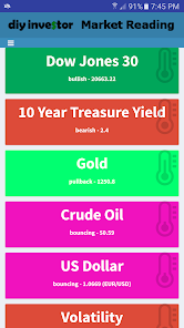
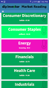
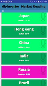
Colors visually indicate the direction of major indexes and asset classes based on customizable moving averages representing short and long-term trends:
Green: both moving averages are rising
Lime: long-term moving average is rising but short-term moving average is falling
Fuchsia: long-term moving average is falling but short-term moving average is rising
Red: both moving averages are falling
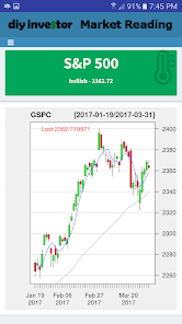
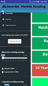
Click on any asset class to display a candle-stick stock chart using the moving averages selected.
Colors visually indicate the direction of major indexes and asset classes based on customizable moving averages representing short and long-term trends:
Green: both moving averages are rising
Lime: long-term moving average is rising but short-term moving average is falling
Fuchsia: long-term moving average is falling but short-term moving average is rising
Red: both moving averages are falling
Click on any asset class to display a candle-stick stock chart using the moving averages selected.
Updated on
Safety starts with understanding how developers collect and share your data. Data privacy and security practices may vary based on your use, region and age The developer provided this information and may update it over time.

No data shared with third parties
Learn more about how developers declare sharing

No data collected
Learn more about how developers declare collection
What's new
Target SDK update.