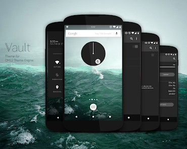
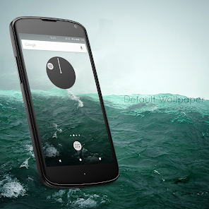
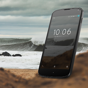
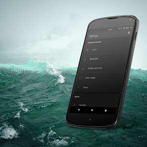
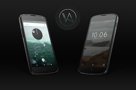
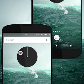
Vault - CM12 Theme
4.2star
2.62K reviews
100K+
Downloads

Everyone
info


About this app
NOTE: This theme is only for the CyanogenMod 12 Theme Engine. If you don't use any rom based on CM12, please, don't install this.
What this theme contains?
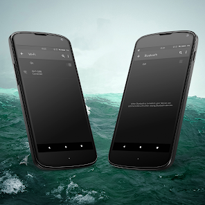
Overlays:
- Framework
- - Switch, scrubber, buttons, colors and styles
- System UI
- AOSP Keyboard
- CM Browser
- CM Filemanager
- CM Updater
- CM Music Player (Eleven)
- CM Sms
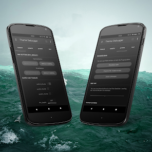
- CM Theme Manager
- Contacts
- Phone
- Gallery
- Settings
- Sound Recorder
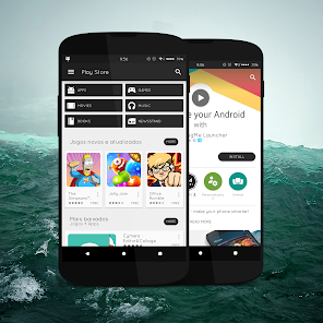
- Google Play Store
- Google Play Music
- Google Plus
- Google Gmail
- Google Keep
- Google Hangouts
- Google Youtube
- WhatsApp
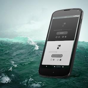
Font:
- Quicksand
Icons:
- MMII icon pack from stalker018 (http://stalker018.deviantart.com)
Ringtones:
- Morphiz Skin Family ringtone
What this theme contains?
Overlays:
- Framework
- - Switch, scrubber, buttons, colors and styles
- System UI
- AOSP Keyboard
- CM Browser
- CM Filemanager
- CM Updater
- CM Music Player (Eleven)
- CM Sms
- CM Theme Manager
- Contacts
- Phone
- Gallery
- Settings
- Sound Recorder
- Google Play Store
- Google Play Music
- Google Plus
- Google Gmail
- Google Keep
- Google Hangouts
- Google Youtube
Font:
- Quicksand
Icons:
- MMII icon pack from stalker018 (http://stalker018.deviantart.com)
Ringtones:
- Morphiz Skin Family ringtone
Updated on
Data safety
Developers can show information here about how their app collects and uses your data. Learn more about data safety

No information available
Ratings and reviews
4.3
2.56K reviews

Lexington Thanlyin
- Flag inappropriate
November 23, 2021
The best theme

A Google user
- Flag inappropriate
April 24, 2015
The WiFi with the exclamation sign, those little arrows which you move the cursor with, and the Quick Settings icons need to be themed as well. The font looks bad, I think you should keep the default one. Please don't waste your time with the icons, because there are many beautiful icon packs already in the store. I congratulate you for your work. This theme has great potential. I am looking forward for future updates ☺
26 people found this review helpful
A Google user
- Flag inappropriate
September 27, 2015
The theme looks great with the modified play store and black tinted backgrounds ! However the text at numerous places appears in the same color as background, making it to difficult to read. Other than that the theme works very well. The boot animation and fonts are a great addition too. The notification sign for signal strength looks messy and out of position !