
Budget: expense tracker, plann
應用程式內購買
4.2star
1.86K 則評論
100K+
次下載

所有人
info

關於此應用程式
你有沒有遇到這樣一個事實:在月底你不明白你的所有錢去了哪裡?
每次你保證自己要保存,但這個月太長了,每天都要記住它?
我們也是。
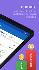
因此,我們創建了“預算” - 一種控制個人財務的便捷工具。
在遊戲形式中,我們將向您展示:
- 如何快速輕鬆地增加收入和支出
- 如何計劃費用。
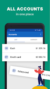
- 如何將您的所有帳戶保存在一個位置。
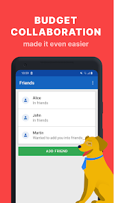
- 如何將家庭成員添加到應用程序並將會計轉變為有趣的時間。
- 在所有可訪問Internet的移動設備上同步數據。
- 我們同時支持多種貨幣,這使得該應用程序非常適合旅行。
如果您之前從未有過預算:
- 我們的應用程序將幫助您創建和計劃“常規”月收入和支出,以便您可以將所需的成本與實際成本進行比較。
如果您沒有第一次創建預算:
- 您可以為自己完全自定義預算,例如,保留私人企業家或小型企業的預算。
- 或者同時保留幾個預算。
那麼什麼呢?
我們不保證在使用我們的應用程序後,您將變得富有和著名。但我們相信,我們會幫助您和您的家人了解花錢的位置並捕捉有趣的模式。
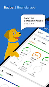
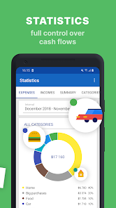
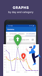
- 您可以在收入和支出的美麗信息圖中查看所有數據。
- 我們有一個獨特的日曆,您可以在白天查看購買歷史記錄和統計數據。
我們真誠地樂意為您提供幫助,因此訂閱的前45天免費!我們相信,在此期間,借助我們的服務,您可以在我們要求永久訂閱之前節省更多。
您的數據在亞馬遜數據中心中是完全安全的。
該服務與雲存儲配合使用,自動同步後台的所有數據。
您可以使用多個設備中的應用程序(例如,從手機和平板電腦) - 您的數據將在它們之間自動同步。很快它也可以在網站上工作。
我們使用加密結合其他通信安全技術保護您的數據,我們的服務器位於愛爾蘭的亞馬遜網絡服務數據中心,提供最高級別的安全性。
您可以在“隱私政策”部分或我們的網站https://www.apptronic.net上找到有關數據保護的更多信息。
每次你保證自己要保存,但這個月太長了,每天都要記住它?
我們也是。
因此,我們創建了“預算” - 一種控制個人財務的便捷工具。
在遊戲形式中,我們將向您展示:
- 如何快速輕鬆地增加收入和支出
- 如何計劃費用。
- 如何將您的所有帳戶保存在一個位置。
- 如何將家庭成員添加到應用程序並將會計轉變為有趣的時間。
- 在所有可訪問Internet的移動設備上同步數據。
- 我們同時支持多種貨幣,這使得該應用程序非常適合旅行。
如果您之前從未有過預算:
- 我們的應用程序將幫助您創建和計劃“常規”月收入和支出,以便您可以將所需的成本與實際成本進行比較。
如果您沒有第一次創建預算:
- 您可以為自己完全自定義預算,例如,保留私人企業家或小型企業的預算。
- 或者同時保留幾個預算。
那麼什麼呢?
我們不保證在使用我們的應用程序後,您將變得富有和著名。但我們相信,我們會幫助您和您的家人了解花錢的位置並捕捉有趣的模式。
- 您可以在收入和支出的美麗信息圖中查看所有數據。
- 我們有一個獨特的日曆,您可以在白天查看購買歷史記錄和統計數據。
我們真誠地樂意為您提供幫助,因此訂閱的前45天免費!我們相信,在此期間,借助我們的服務,您可以在我們要求永久訂閱之前節省更多。
您的數據在亞馬遜數據中心中是完全安全的。
該服務與雲存儲配合使用,自動同步後台的所有數據。
您可以使用多個設備中的應用程序(例如,從手機和平板電腦) - 您的數據將在它們之間自動同步。很快它也可以在網站上工作。
我們使用加密結合其他通信安全技術保護您的數據,我們的服務器位於愛爾蘭的亞馬遜網絡服務數據中心,提供最高級別的安全性。
您可以在“隱私政策”部分或我們的網站https://www.apptronic.net上找到有關數據保護的更多信息。
更新日期


評分和評論
4.2
1.83K 則評論

Google 使用者
- 舉報不當內容
2017年4月4日
The idea of the design is very professional. It can help to plan/control your budget for the specific expense. You can look at the chart and know how much you spent in the specific period of time and if you need to reduce the expense. This is the best budget APP I've ever tried among the popular financial APPs. Basically, the design of the APP is really engineering directed and would need a more user-friendly design to be easily used by the general people. I also have some suggestions to make the APP better: 1). The Overview tab can be designed to include more information, such as Pie Chart/Statistics->Bugdge Items. The countdown days should also be put in the Overview page. The page can be designed and make the visualized options be selectable by the users. I would suggest the Overview page be more visualized instead of just putting the technical numbers and bars. 2). The same, Statistics->SUMMARY is also too boring, it should contain some visualized graph/chart instead of putting the details in the bottom scroll bar and let the user navigate the scroll bar to find the amazing functionality.
apptronic.net
2017年4月4日
Thank you for your review.
We will take into account all your comments and proposals to make our service better.
最新動向
Fixed issues with subscriptions renewal


