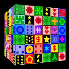
Cubistry

4.7star
5.24K reviews
100K+
Downloads
Teacher Approved

Everyone
info
Free with a Play Pass subscription Learn more


About this game
Safety starts with understanding how developers collect and share your data. Data privacy and security practices may vary based on your use, region, and age. The developer provided this information and may update it over time.

No data shared with third parties
Learn more about how developers declare sharing

No data collected
Learn more about how developers declare collection

Committed to follow the Play Families Policy
Ratings and reviews
4.7
4.51K reviews

A Google user
- Flag inappropriate
April 28, 2020
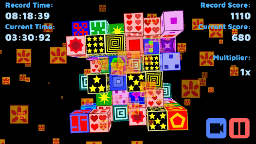
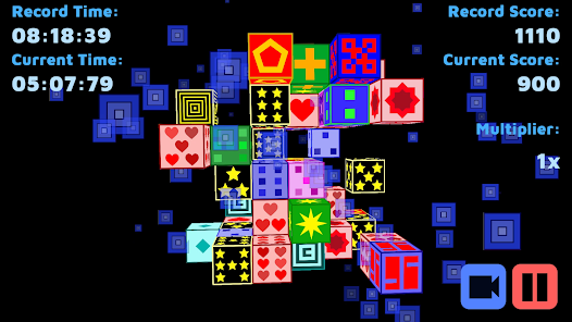
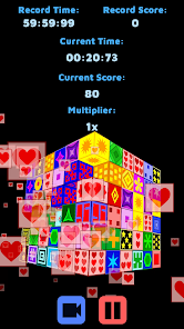
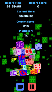
It's mahjong, just in a cube and with some different play styles. Could be fun, but I find the outlined text headache-inducing to read, and the graphics are... not to my taste. I like the retro vibe, but the execution is a little off, and the colors are hideous (imho). Having a selection of color palettes would help a lot. The physics are also a bit abrupt, and two-finger controls for the cube rotation would help users get the orientation right.
174 people found this review helpful

Bacon Lars
- Flag inappropriate
- Show review history
November 11, 2020
The new update has chosen a very strange font type and color. I liked how it was before and find it more jarring now. It doesn't fit very well especially when you see the title of the game. During game play the text for the timer, score, etc is slightly in the way. I think rather change it back to the old font and give players choice to choose colors? Maybe even a scalable UI? Thanks.
163 people found this review helpful

Joanne Huntington
- Flag inappropriate
December 26, 2021
Great game for a quick break. One suggestion, though - I have seen several PRs evaporate in Stationery mode when the last 2 pieces are superimposed after I spent 20 secs tapping hopefully on the top one hoping to "catch" the one beneath at the right millisecond. Would it be possible to change the game to make it easier to match in this situation? Like a "hit behind" control, or enlarging the sweet spot for a completely covered up cube?
63 people found this review helpful
What's new
-Requirements update.


