Moon Calendar - Moony
Contains adsIn-app purchases
4.6star
4.51K reviews
100K+
Downloads

Everyone
info


About this app
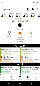
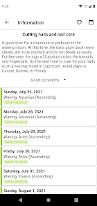
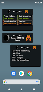
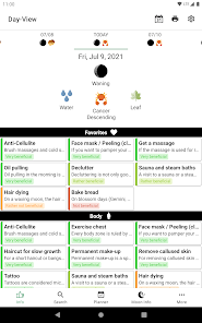
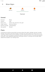
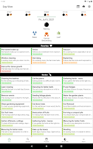
Moony is a beneficial guide and reference book for you to live your everyday life in harmony with the moon phases. It shows you the current phase of the moon as well as the current Zodiac sign.
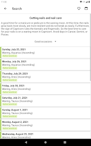
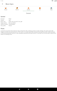
The lunar calendar offers detailed tips and recommendations based on ancient knowledge.
- You would like to know when you should cut or dye your hair?
- You have problems cutting your fruit trees?
- The house cleaning should be as quick as possible?
Moony offers you a well-arranged overview for the desired information!
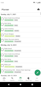
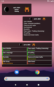
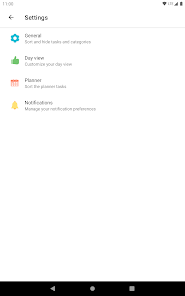
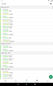
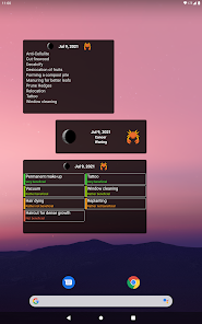
There are also 3 Widgets available for a quicker overview:
- Basic Overview Widget
- Favorites Widget
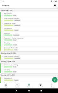
- Planner Widget
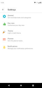
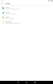
Customize the app according to your needs. You can:
- choose favorite tasks
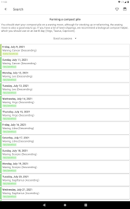
- configure a planning calendar
- customize the day view
- disable categories or tasks in which you are not interested
- change the sort order
- choose a custom time for the notifications
Have fun!
Manu and Markus
The lunar calendar offers detailed tips and recommendations based on ancient knowledge.
- You would like to know when you should cut or dye your hair?
- You have problems cutting your fruit trees?
- The house cleaning should be as quick as possible?
Moony offers you a well-arranged overview for the desired information!
There are also 3 Widgets available for a quicker overview:
- Basic Overview Widget
- Favorites Widget
- Planner Widget
Customize the app according to your needs. You can:
- choose favorite tasks
- configure a planning calendar
- customize the day view
- disable categories or tasks in which you are not interested
- change the sort order
- choose a custom time for the notifications
Have fun!
Manu and Markus
Updated on
Safety starts with understanding how developers collect and share your data. Data privacy and security practices may vary based on your use, region, and age. The developer provided this information and may update it over time.

No data shared with third parties
Learn more about how developers declare sharing

This app may collect these data types
Location, App activity and 2 others

Data is encrypted in transit

You can request that data be deleted
Ratings and reviews
4.7
4.32K reviews

Barbara Boyd
- Flag inappropriate
- Show review history
July 24, 2021
I love the app however the neon coloring is visually distracting . The previous format provided defined separation. Also, the tool bar at the top was better. Enlarging the advertisement bar does not entice me to want the product more. It is an irritant and interferes with the experience. It's understandable that you might want a fresh look but for me the new look has taken away from the enjoyment of the app. Thank you for allowing my voice to be heard.
22 people found this review helpful
Freckled OG
July 24, 2021
Hello there! Thank you for your kind feedback :) You can switch back to the old colors, if you desire. Go to "Settings" - "Theme" - and activate "Old design" :) Please also have a look at the other settings to customize your experience! You can also hide a lot of the elements in the day view to make it more clear. Greetings, your Moony Team

A Google user
- Flag inappropriate
May 7, 2019
Tons of interesting info but low quality, small images of actual moon in its phase! Too much emphasis on all the info, too little emphasis on the actual appearance of the moon in its phase! Widgets are terrible, needs at least one simpler widget with an image of current moon phase & the moonrise/moonset times beneath the image. Probably uninstalling for different app with higher quality moon images in phase, similar info, & better widgets.
14 people found this review helpful

Linda Haycox
- Flag inappropriate
May 7, 2024
I have been using this app for a couple years now and I love all the information it gives. I check it every day and I like that I can choose my favorites and they are at the top. But I did like the old style better. I have showed this app to several friends and family and they now use it as well. I look forward to more items being added..


