
U-M Magic Bus
1.5star
77 reviews
5K+
Downloads

Everyone
info


About this app
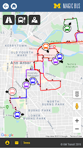
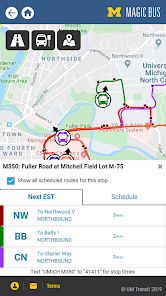
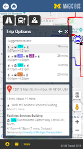
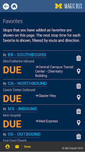
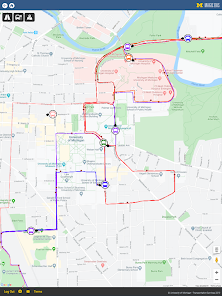
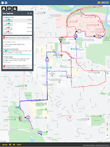
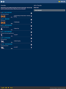
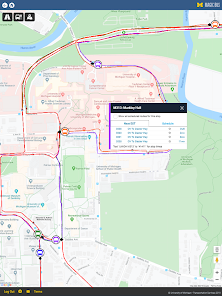
U-M Magic Bus, your guide to campus bus travel at the University of Michigan. Plan a trip, find a bus route, track your bus, and get real-time bus arrival information on your Android mobile device. The application uses data provided by University of Michigan – Transportation Services and its bus tracking system over your device's WiFi or cellular network connection. Magic Bus riders have real-time bus information at their fingertips for the first time. Enter your starting location and destination to access fast trip planning. Save your favorite bus stop on the app for quick bus arrival information. Receive rider alerts and detours on your device, before you head out the door. Click on the University of Michigan system map, select a route, and see where your bus is in real time. Traveling by bus has never been this easy!
Updated on
Safety starts with understanding how developers collect and share your data. Data privacy and security practices may vary based on your use, region, and age. The developer provided this information and may update it over time.

No data shared with third parties
Learn more about how developers declare sharing

This app may collect these data types
Location and Personal info

Data is encrypted in transit
Ratings and reviews
1.5
77 reviews

A Google user
- Flag inappropriate
February 29, 2020
Should start on the map screen, not on a menu with many options that people are probably not coming on the app for. It's glitchy and laggy when zooming in and out, all the logos are ugly, routes that are not in service (like the commuters on weekends) are not labeled as such in any way. The routes button is a weird road symbol, I would appreciate if the button literally just said "routes". Y'all know what double map looked like, you can at least make it the same quality...
11 people found this review helpful
A Google user
- Flag inappropriate
February 9, 2020
The map is a bit laggy, and the estimated arrival times for buses are often covered up by the bar on the bottom of the screen when you click on a stop. However, you can get around this problem by searching for stop times without the maps. The trip planner function, which seems to be able to plan trips using Ride buses, also seems helpful though I haven't used it yet. Overall, I'd switch to this app once the interface (especially the map) is cleaned up, but for now I'm sticking with Doublemap.
9 people found this review helpful
A Google user
- Flag inappropriate
February 6, 2020
I really hope this is just an early version of the application because it is slow and glitchy right now. When you click on the routes, you select one and the route menu won't go away unless you click on the map. Also 50% of the times, the bus I got on wasn't even on the map. I don't know why DoubleMap is being taken away, because this app is LITERALLY a copy of DoubleMap but a lot worse. I hope UMich makes this app better ASAP
14 people found this review helpful
What's new
Updated to API level 33.


