
San Diego Zoo
4.3star
740 reviews
100K+
Downloads

Everyone
info

About this app
Safety starts with understanding how developers collect and share your data. Data privacy and security practices may vary based on your use, region, and age. The developer provided this information and may update it over time.

No data shared with third parties
Learn more about how developers declare sharing

This app may collect these data types
Location, Personal info and 3 others

Data is encrypted in transit

Data can’t be deleted
Ratings and reviews
4.3
723 reviews

Michael OConnor
- Flag inappropriate
September 27, 2024
From what I've heard the APP is useful, but as a person who has a visual impairment, it would be nice if there were a dark contrast version to reduce glare, and larger fonts. This is too bright for me, the glare makes it undecipherable, and the fonts are tiny. Even if it did have a visually impaired setting it is doubful if I could even find it with the microscopic fonts and challlenging contrast scheme. Just a thought for the devs. Dark Backgrounds and a larger font would be wonderful.

Nunya Biz
- Flag inappropriate
July 27, 2024
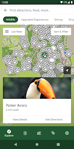
Stick with the paper map. Possibly it's just a bug with this version since older reviews seem fine, but it's a laughably terrible app. I had precise location enabled but it literally showed us on the polar opposite end of the park we actually were. Not all the animals were options to select to add to your itinerary. You can map the directions to specific animals but it won't determine the best route for what you have selected, which would make sense

Elza Kinde
- Flag inappropriate
July 28, 2023
I love the option to have our memberships and tickets on my phone. The map is really difficult to use from my phone because it doesn't include any of the markers which their print maps have, and their system to help guide you to a selected exhibit is a bit difficult as it's essentially just a blue line you have to try and orient yourself to follow. I also wish it was possible to plan your route based on the animals you wanted to see rather than just making a list in the Plan Your Visit section.
3 people found this review helpful
What's new
This update contains minor updates, bug fixes, and performance improvements.
App support
About the developer
Zoological Society Of San Diego
dlasater@sdzwa.org
2920 Zoo Dr
San Diego, CA 92101
United States
+1 619-957-2499


