iSolarCloud
3.1star
4.73K reviews
1M+
Downloads

Everyone
info
About this app
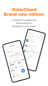
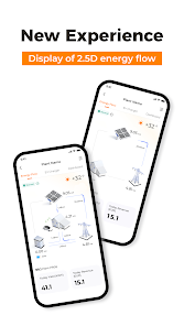
iSolarCloud provides operational analysis and mobile operation and maintenance services for plants, which is an extension of Web's functions.Services provided mainly are: plant connection, remote parameter configuration, WLAN configuration, fault management, alarm reporting push, device monitoring, knowledge repository, etc.;
Updated on
Safety starts with understanding how developers collect and share your data. Data privacy and security practices may vary based on your use, region, and age. The developer provided this information and may update it over time.

No data shared with third parties
Learn more about how developers declare sharing

This app may collect these data types
Location, Personal info and 2 others

Data is encrypted in transit

You can request that data be deleted
Ratings and reviews
3.2
4.53K reviews

Alex Niral
- Flag inappropriate
December 13, 2025
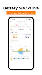
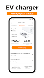
Decent app that shows relevant information - Power generated - power to house - power to grid - grid power being used - summaries of daily information. Occasionally, the app fails to show relevant information and does not display power info correctly. After a few minutes, it corrects itself and all is good. I have not seen one add pop up during its use (Android user).
Sungrow Power Supply Co., Ltd.
December 15, 2025
Thank you for your support. We appreciate that you enjoy iSolarCloud. Your feedback motivates us to keep improving our platform for you.

Gavin Rowell
- Flag inappropriate
December 10, 2025
Overall very good. Sometimes a bit slow to update telemetry. It would be good to have an easy battery charge, dispatch and feed-in limitation function available to regular users.
Sungrow Power Supply Co., Ltd.
December 11, 2025
Thank you for your feedback. We appreciate your suggestion and will share it with our development team. We strive to keep improving our platform for you. If you would like to discuss it further, kindly contact us at isolarcloud@sungrowpower.com and if possible, with the relevant screenshots and the country you are in, thus we can better assist you.

Andrew Phillips
- Flag inappropriate
October 26, 2025
It worked pretty well but yesterday I got a message that the software was out of date and would not let me continue. I went to Google Play but it said the software was already up to date - so all I could do was uninstall. After reinstalling it did not recognise my login so I tried forgot password but it says "incorrect phone number format" (with/without int. prefix etc), and also did not recognise my email address. So I CAN'T USE IT now.
3 people found this review helpful
What’s new
[New Feaure] SN data is now displayed for battery Packs, making information retrieval more convenient.
[New Feature] Live data can now display AC voltage and current curves for single-phase inverters.
[Optimization] S/N occupation prompts for inverters and other devices have been optimized for clearer operational guidance.
[New Feature] Live data can now display AC voltage and current curves for single-phase inverters.
[Optimization] S/N occupation prompts for inverters and other devices have been optimized for clearer operational guidance.
App support
About the developer
阳光电源股份有限公司
appdev@sungrowpower.com
中国
安徽省合肥市
高新区习友路1699号
邮政编码: 230088
+852 9147 7071


