A Dark Room ®

4.7star
9.28K reviews
100K+
Downloads

Everyone
info


About this game
Safety starts with understanding how developers collect and share your data. Data privacy and security practices may vary based on your use, region, and age. The developer provided this information and may update it over time.

No data shared with third parties
Learn more about how developers declare sharing

No data collected
Learn more about how developers declare collection
Ratings and reviews
4.7
9.07K reviews

Cedric Parker
- Flag inappropriate
April 30, 2024
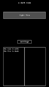
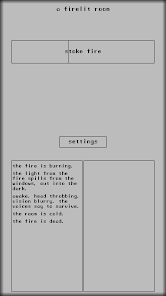
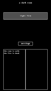
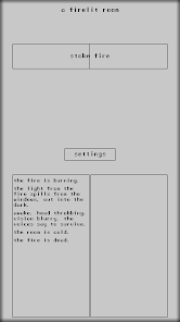
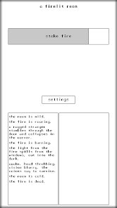
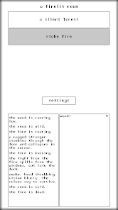
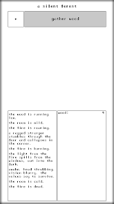
Loved this game and beat it a few times though the years. Picked it back up and recently was doing my first run of an alternative playthrough over the last few months. Going to be honest, the new visuals are not it. It's too much clutter and is trying too much. I loved the extremely simple UI contrasted against a confusing and, at times, harsh world. If there was a button to go back to the old UI, I'd finish this run. For now, I'm just finished with the game.
2 people found this review helpful
Amir Rajan
April 30, 2024
Some context. The problem is I get countless emails about how the game doesn't look right because. The underlying reason is because the user replaced their system font with some calligraphy style presentation.
The clutter you're feeling is because of the 1-star reviews I received about the supplies not being visible on every screen.
Suggestions?

ArtfulDodger1837
- Flag inappropriate
April 26, 2024
It was totally a 5* game before, but the UI and gameplay update ruined it for me. Forced landscape, a color scheme that is darker and makes it harder to see, incredibly cluttered screens where there used to be a simple, minimalistic beauty, increased confusion with the looting and combat mechanics.. The only thing that's neat is the addition of sound. If I can't roll it back to an earlier version, I don't think I'll continue to play it as it stands.
4 people found this review helpful
Amir Rajan
April 29, 2024
The latest version reintroduced portrait mode (version 16.8).

Nicholas Dougherty
- Flag inappropriate
April 23, 2024
I want to preface this by saying the browser version is amazing. I am hooked. 10/10 The mobile version is not as good. Aside from the UI not being the most intuitive system, (which is understandable) I really just wish there was a Dark Mode/etc, and that the player's inner monologue/updates/etc didn't block the screen and actions. There should be a way to swipe them away or have them out of the way of the interactables. It just slows everything down too much for a game that costs money..
2 people found this review helpful
What's new
Minor tweaks to the visuals of the path (also heal while walking).


