Garmin Connect™
3.9star
944K reviewsinfo
10M+
Downloads

PEGI 3
info
About this app
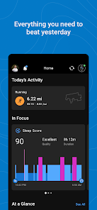
The Garmin Connect™ app is your one-stop source for health and fitness data. Whether you’re training for a race, keeping active or just staying on top of your health, Garmin Connect provides the information and inspiration you need to reach your goals.
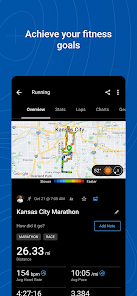
Once you pair your phone (1) with a Forerunner®, Venu®, fēnix or another compatible Garmin device (2), you can review your tracked activities and health metrics. Plus, you can create workouts, build courses and challenge your friends on the leaderboard.
With Garmin Connect you can:
- Personalize your home screen, so the most helpful information is instantly visible
- Analyze your activities with detailed statistics(3)
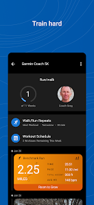
- Create customized workouts and courses
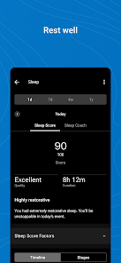
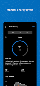
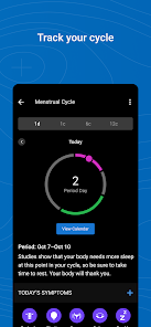
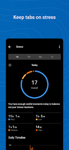
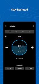
- Review trends in health metrics like heart rate and steps
- Earn badges for accomplishments
- Sync with other apps like MyFitnessPal and Strava
- Get support for Garmin devices and their features
Learn more about Garmin devices and how they work with the Garmin Connect app at Garmin.com.
(1) See compatible devices at Garmin.com/BLE
(2) See a full list of compatible devices at Garmin.com/devices
(3) See Garmin.com/ataccuracy
Notes: Continued use of GPS running in the background can dramatically decrease battery life.
Garmin Connect needs SMS permission to allow you to receive and send SMS text messages from your Garmin devices. We also need call log permission to display incoming calls on your devices.
Once you pair your phone (1) with a Forerunner®, Venu®, fēnix or another compatible Garmin device (2), you can review your tracked activities and health metrics. Plus, you can create workouts, build courses and challenge your friends on the leaderboard.
With Garmin Connect you can:
- Personalize your home screen, so the most helpful information is instantly visible
- Analyze your activities with detailed statistics(3)
- Create customized workouts and courses
- Review trends in health metrics like heart rate and steps
- Earn badges for accomplishments
- Sync with other apps like MyFitnessPal and Strava
- Get support for Garmin devices and their features
Learn more about Garmin devices and how they work with the Garmin Connect app at Garmin.com.
(1) See compatible devices at Garmin.com/BLE
(2) See a full list of compatible devices at Garmin.com/devices
(3) See Garmin.com/ataccuracy
Notes: Continued use of GPS running in the background can dramatically decrease battery life.
Garmin Connect needs SMS permission to allow you to receive and send SMS text messages from your Garmin devices. We also need call log permission to display incoming calls on your devices.
Updated on
Safety starts with understanding how developers collect and share your data. Data privacy and security practices may vary based on your use, region and age The developer provided this information and may update it over time.

No data shared with third parties
Learn more about how developers declare sharing

This app may collect these data types
Personal info, Health and fitness and 3 others

Data is encrypted in transit

You can request that data be deleted
Ratings and reviews
3.9
929K reviews

Alex Palacios
- Flag inappropriate
- Show review history
29 April 2024
Guys, really... What's the point of the changes? Now there is way less information visible in the app, everything's buried under several clicks, the screen in mostly unused... The previous version was not perfect, but this update is amateurish at best. I'd rather roll back. I appreciate the effort that goes into the development of the app, I really do, but this time it turned out way worse than it was.
79 people found this review helpful

Vanderstel
- Flag inappropriate
27 April 2024
The recent update overhauled the UI completely and made it so much worse. Less information on your screen (maybe 50% of the screen is now blank space?), more scrolling and clicking to see what you want, less customizable, even smaller font to emphasize the emptiness and make it harder to read! It brings nothing new either! Please roll back this update and bring back the old, compact, all at a glance UI!
29 people found this review helpful

Harm Geerts
- Flag inappropriate
- Show review history
25 April 2024
I dislike the new layout because it makes it harder to view my data. The home screen cannot show everything I want because of arbitrary limits... Focus cards take up a lot of space. Swiping side to side on the focus cards is horrible, stacking would have been better. Cards that have nothing to show are still visible and waste space. All I want is to scroll down and see my selected metrics in a large, medium or small size of my choosing.
38 people found this review helpful
What's new
Garmin Connect has a new look. You can now personalize your home screen to put what’s most important to you front and center, including your preferred stats, events, training plans, challenges, historic trend data and more.


