EPA's AIRNow
3.7star
938 reviews

Everyone
info
Government
info
100K+
Downloads

Everyone
Learn more

About this app
The AIRNow Android application will provide an increasingly mobile public with real-time air quality information that people can use to protect their health when planning their daily activities
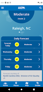
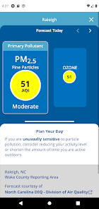
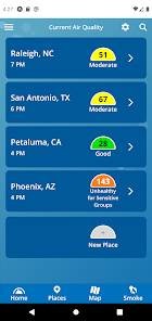
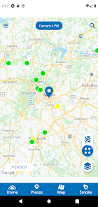
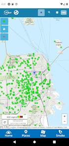
The app will allow users to get location-specific reports on current air quality and air quality forecasts for both ozone and fine particle pollution (PM2.5). Air quality maps from the AIRNow website provide visual depictions of current and forecast air quality nationwide, and a page on air quality-related health effects explains what actions people can take to protect their health at different AQI levels, such as “code orange.”
The app will allow users to get location-specific reports on current air quality and air quality forecasts for both ozone and fine particle pollution (PM2.5). Air quality maps from the AIRNow website provide visual depictions of current and forecast air quality nationwide, and a page on air quality-related health effects explains what actions people can take to protect their health at different AQI levels, such as “code orange.”
Updated on
Safety starts with understanding how developers collect and share your data. Data privacy and security practices may vary based on your use, region, and age. The developer provided this information and may update it over time.

No data shared with third parties
Learn more about how developers declare sharing

No data collected
Learn more about how developers declare collection
Ratings and reviews
3.8
890 reviews

A Google user
- Flag inappropriate
September 15, 2018
Clean, easy to use interface that works great! Has a very small footprint (as in kilobytes). In addition to current readings, provides forecast and map. Plus, uses a tiny amount of data (mine averages just kilobytes over several months). Unintrusive - asks for just what it needs (only GPS). Not a battery killer either, doesn't query the GPS excessively, nor will it vampire your device performance (like some apps running/communicating constantly as a background app) Bonus - doesn't have/cause ads, nag-ware, or performance issues -- even though it's free. I've used it for years, and prefer it to (getting just) the emails because it provides updated readings throughout the day. This app is one of the first things I install whenever I change mobile devices. A 'must have' for me, I use it every day!
47 people found this review helpful

Shawn
- Flag inappropriate
September 10, 2025
Used to work exceptionally well. Now it's slow to load and won't show the Places, Map, or Smoke options (buttons stay grayed out). The "Last 24 hours" data won't load. Overall, it looks suspiciously like the Trumpified EPA decided to take a high functioning app and deliberately break it, which would fit with the rest of what they're doing. Note that the phone I'm running it on hasn't changed and is a recent model, so that's not the problem. It's the app that's broken.
30 people found this review helpful

A. Spehr
- Flag inappropriate
- Show review history
July 28, 2020
Doesn't give real time data? I don't know. The website data is always several hours delayed. This doesn't give a time stamp of when it was last updated. Also doesn't let me see nearest monitors, and I'm in between several. Useful for doing a quick check of different places I'm traveling to though. But the website is probably easier to use, although much slower loading. And then load again to get actual monitor location data... So slow.
103 people found this review helpful
What’s new
- Ability to search via user's location
- Fix minor bug with filtering on the map
- Other minor bug fixes
- Fix minor bug with filtering on the map
- Other minor bug fixes
Everyone
Learn moreApp support
About the developer
ENVIRONMENTAL PROTECTION AGENCY
mobiledeveloper@epa.gov
1301 Constitution Ave NW
Washington, DC 20460
United States
+1 202-853-2107


